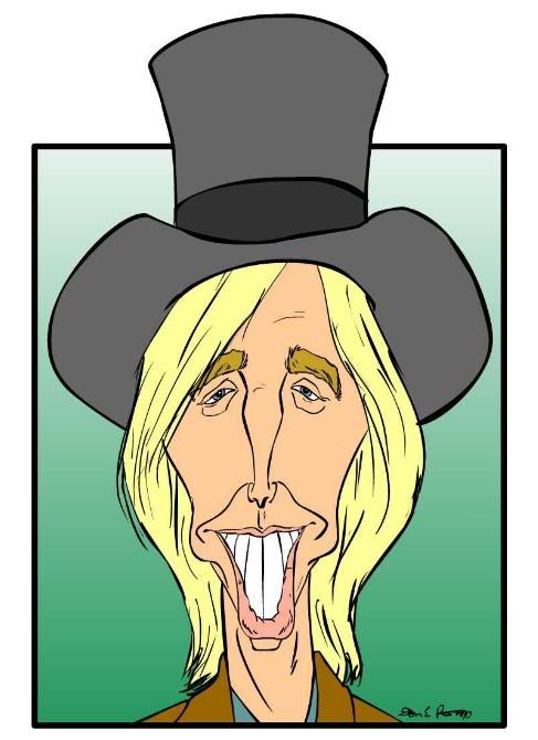
i was able to do this one up quickly, though. now, for those of you reading this who aren't artists, here's a little trick artists often use to check the accuracy of their work: flip it. that is, hold it up to a mirror, or, in the case of digital creations, all drawring programs have a "flip" function that allows you to see your drawring backwards. you'd be surprised how different it makes the artwork look. mistakes the artist hadn't previous noticed become immediately apparent...
don't do that with this drawring. i drew it very quickly (in flash), and, even though i didn't have time to fix any problems i might find, i tried flipping it anyway, out of curiosity. it looked hideous! i mean, it looked like a really, really bad caricature. it was weird. so don't do that. just look at it the way it is, because this way i'm actually rather happy with it. it's still not a great piece of work technically speaking, i guess, but i'm very pleased with the likeness.
anyway... here it is, for the e-caricatures monthly contest, tom petty:

4 comments:
Coincidentally, if you flip the real Tom Petty, he looks hideous too. So, I think you got it right.
Well done, sir.
liar!
it's practially the exact same image, just the hairline changes!
good caricature btw.
Looks great Don, sorry to hear about work slowing down, but since I quit animation I've never been busier and it's great being your own boss, NOW BACK TO WORK O'LOUGHLIN!!!!
thanx, guys.
will, i still disagree. the slant of the drawring suddenly becomes much more obvious, and it becomes evident that the features are not properly centred on the face. hideous.
niall, i'm glad there are countries in the world where it's possible to make a career of being a caricaturist.
Post a Comment